You might have the most creative and visually appealing website out there but it will be of little value to you if your customers do not use it. Creating a website is no longer a herculean task but understanding your customers and creating a website that is easy to use is. Nothing can be more frustrating than landing on a website that is difficult to navigate; this frustration compels visitors to leave the site with no likelihood of return.
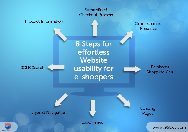
A good website requires a balance of multiple elements – design, content, navigation and functionality. This blog highlights few points that will help you improve your website usability:
Omni-channel Presence
Customers hold the power, and they are currently defining the new rules of e-business. With advancement in technology customer expect businesses to be present across all sales channels and deliver a consistent shopping experience across them and various other touch points. You deliver it, you win it.
Persistent Shopping Cart
Customers hate to redo things while shopping; Persistent shopping cart acts as a boon for the retailers by allowing customers to shop across multiple devices, whenever they want from where they left by saving the shopping cart contents across sessions through “persistent cookies”. No need to search again for a product you have selected once. They can now save the product in their cart at home and buy it days after, while travelling from any device.
Landing Pages
Because of digital ads and affiliate marketing you will get visitors which land on your site via a secondary page. For cases like this it is important that to ensure that you landing page has the right content and links to relevant resources. A landing page is like a first impression which can either convince your customers to spend more time on website and convert or quickly abandon your site for another one.
Load Times
Online shoppers are in no mood to waste time waiting for your website to load. It is important to ensure that your website loads quickly which might require you to compress images, avoid too many animations, etc.
Layered Navigation
Customers find it easy when your page titles are simple. Searching becomes real quick if the navigation is named as the customers describe your categories. Proper navigation modules offer convenient, faster and simpler navigation on your online store, allowing your customers to quickly find the product by selecting the criteria of significance and then straightaway select the product from the popped up relevant product list thereby improving customer satisfaction.
SOLR Search
Normal Search has undoubtedly helped customers over the period; but with evolving technology and customer expectations soaring up, the advanced and powerful search platform SOLR is the talk of the town. It helps customers in finding products conveniently with relevant options while typing and even giving effective suggestions against odd searches.
Product Information
It is now a well-known fact that web users have very short attention spans and most people skim through websites for relevant information. To deal with, your website should have accurate and complete product information so that your customers can find them hassle-free.
Streamlined Checkout Process
Complex checkout processes annoy customers and is a major reason for shopping cart abandonment. Once a customer identifies a product for purchase they expect the subsequent checkout process to be simple and quick. The product specifications, pricing, customer reviews, checkout button, etc. must be readily available for customers and it is best to have a one-page checkout as they are faster, require less detail and are easier to use; they often have better conversion rates.
Subscribe to our blogs
