Traditionally, for eCommerce portals, products photographed against a white background has been the rule of the game. It was always considered that the customer attention is maximized when the focal point is only the product and there are no distractions. While this remains largely true, the customers are now habituated to the cliché models of product presentation. This possibly leads to decreased customer engagement and low conversion warranting the question – Is there anything else that can be done with the product presentation to make customers sit up and take notice?We take a look at some of the things you could do in addition to the static white background image in order to drive up the customer engagement on your portal.
In this blog, we will look at some of the things e-commerce store owners can do to drive up the customer engagement.
1) Life shot Product Pictures
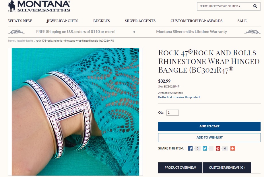
When photographing light colored objects or objects with silver/white surface, the white background and the foreground object don’t contrast with each other. There is a high possibility that the end customer when viewing the product page cannot make out the details of the product. And that translates into a potential loss of sale opportunity.
It is a good idea to include a life shot – picture of the product taken in real life situation. The camera then has more gamut of colors to do the right metering and the product stands out. And this goes without saying – Such real life shots should be in addition to the product detail shots.
i95Dev’s customer – Montana Silver Smiths does this brilliantly. Their product catalog consists of several light-colored or silver products. While surely retaining the standard white shot background picture, they also add a life shot for every product. This clearly establishes how the product can be used and the product is also smartly contrasted with the background to garner the viewer attention.
2) Product Videos
E-commerce studies suggest that 80% of the people who visit an e-commerce store remember the videos they have seen and about 60% of the people are closer to completing a purchase on an e-store when they are able to view a video.
While static product photographs on a white background are the basic form factor of product display, the differentiator in today’s world of increasing buyer experience on the online portals, are the product videos. A little bit of relevant narration along with a crisp video on the practical uses of the product makes for a great viewing experience for the customer. The videos also help viewers absorb and retain more than just reading through a lot of text based specifications.
i95Dev’s customer, QHouseKids does this in a smart way. With strategically placed videos on their product description pages, the customer’s attention is drawn to the embedded videos resulting in longer web page engagements and hence better conversion rates.

3) 360-degree Interactive Product Photos
E-commerce customers cannot touch and feel products before making a purchase. Hence they rely on product images and description to compare products from different sellers. With increasing competition and increasing commoditization of products, businesses need a way to stand out and differentiate their offering from the competition.
One sure way to score over similar product offerings from competitors, while increasing customer engagement, is to include 360-degree interactive photos as part of your product description. This helps customers in understanding the product dimension and physical form better than looking at static images. There are a number of tools available in the market that allow you to produce a 360-degree image of your product offering. Snap36, webrotate360.com, Arqspin are some of the service providers who provides not only the software but also hosts them on their cloud so that you could port or share your 360 product photos across platforms. Estore, physical store digital displays, marketplaces, trade shows etc.,
Snap36, webrotate360.com, Arqspin are some of the service providers who provides not only the software but also hosts them on their cloud so that you could port or share your 360-degree product photos across platforms – e-commerce store, physical store digital displays, marketplaces, trade shows etc.,
Best buy Canada has incorporated high-resolution 360-degree images in their product description pages which enable the customers to evaluate the product in an interactive way before deciding to stop on their way to work to pick the product.

4) Dark and Colorful Background is a Stunner
This one works like a charm. While white background static images are indeed what you see in 8/10 e-commerce stores, evaluate different color backgrounds that work well with your brand and product. Your product might be the best out there, but customers buy what they see. Cliché images might kill the deal for you.Products with fine textures, shapes, outlines, contours, light.
Products with fine textures, shapes, outlines, contours, light colors, etc. are highlighted better with a dark background and shadow lighting. Generally speaking, dark background works well for elegant or creative products. Even hand made products appeal is higher against a black background. Product images with a black, mid gray or other dark background are the most versatile to define product shapes and forms.
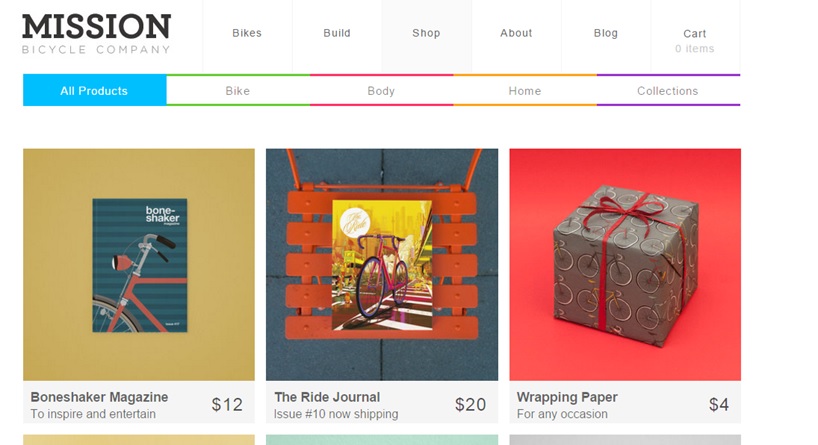
Mission Bicycle – A custom build bicycle shop based out of San Francisco is an expert when it comes to showcasing their bikes against different colored and textured backgrounds. They straightaway make a statement to the customer on the product’s uniqueness and this is only helped by the right choice of colors for the background.
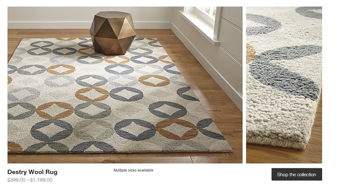
5) Props help Accentuate the Product
Product images along with props, often used in advertisements, can help you evoke an emotional response from your customer. This is a must if you have an option to show multiple product images and right budgets. Foremost, consider the product for its size, shape, and color. And then add props that emphasize these qualities can help the product image more.
But remember, the use of props should be consistent across the e-commerce store to curate an aesthetic consistent theme that works well with the brand aesthetic. Styling your photos with props makes a stand out when compared to similar products offered by your competitors.
Crate and Barrel employ this very effectively in their Rugs catalog. With a flat and mundane outline like rugs, Crate and Barrel have cleverly employed props in their product pictures to enhance and compliment the product. They have not gone for extravagance – but the one prop balances the pictures and brings in the added appeal.
So, while this is not to take anything away from the white clean backgrounds which are used in most of the e-commerce product pictures, usage of different colors and interactive content (depending on the type of the product along with the branding that your product carries) acts as a differentiator when you present your product pictures (in addition to the white background shot) in comparison to similar products sold by your competitors. The attention span of your customer being very short on your product offerings, the different types of product presentation either through videos, photos or interactive photos will only ensure that the span is maximized resulting in higher conversions for your store.


